A few months ago I came across a web editor called Quanta Plus and have not stopped using it since. I always used DreamWeaver for most of my HTML coding, but when I made the transition to Linux I knew that this was not going to be an easy task, having DreamWeaver installed in Linux was going to be a problem. So like everyone else in search of something new, I searched and searched and sadly to say that the candidates that I came across were not very good candidates at all as replacements for DreamWeaver (e.g. Mozilla SeaMonkey, Bluefish, Amaya, Komozer, Nva).
Most of the candidates were either too complex, crashed, or too out of date with minimal improvements. So when I came to install Quanta from the Ubuntu Software Center in Ubuntu, I thought why not I will just uninstall it if I do not like it. Well to my surprise I was impressed.
The pane structure reminded me of DreamWeaver. It allowed me to see the changes take effect on the top pane as I coded on the bottom one. That was great because that is what I was aiming to find in an editor, which only DreamWeaver and a couple of other proprietary HTML editors can do.
The drawback though, there is no control as to moving the panes around. In DreamWeaver one has the option of moving the source editor on the top or the bottom or vise versa with the visual editor, but you can still enable a full screen for the source editor, visual editor, or even display both. The visual editor is always on the top and the source one at the bottom.
One interesting thing that I found is the way Quanta handles tables. In DreamWeaver table format is displayed in the menu tool bar, while in Quanta there is no control of the menu toolbar. Most of the control is emphasized in other tool bars with various names. You can customize things by going to the menu bar under "Settings > Configure Toolbars...".
To create a table in Quanta the developer will have to go to "Tables > Table Editor". The cursor must be placed on the source editor section and not in the visual editor section in order for it to work. This also applies to modification of the tables as well. In order to modify a table the cursor must be placed in any tag within the table code on the source editor section and then by clicking on the tables tab and selecting Table Editor.

There is a Style tab which gives the options for modifying certain tags or elements, but I do not recommend using them for larger projects. Create you own style sheets and link to them by going to "Other > Link Tag". The icon will look like a ship anchor and the last one on the list. If you click on it, a pop-up window shows up. Click on the button next to the blank area where it says Href: and browse for your stylesheet. Then under Type select text/css then click on OK.

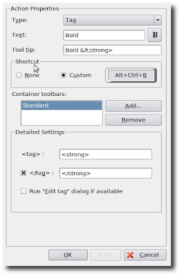
One problem that I recently resolved was that I did not wanted to bold words out by manually typing in the code nor did I like the option given by the editor. So I went to the Menubar under "Settings > Configure Actions" and clicked on Styles then clicked on New Action at the bottom left hand side of the pop-up window. I left Type: as is. On Text: I typed the letter B and optionally clicked on the box next to it and browsed over to Other icons until I select tag_bold and then clicked OK and on the Tool tip: section I typed Bold. I left Shortcut as is as well as the Container toolbars: as I only wanted it to appear in the Style tab. Then on the <tag> area I typed <b> and checked off the </tag> and in its area added </b>. There is another way of doing this without going through all that tedious task and that is by changing the bold style already setup in the Standard tab. Under the Container toolsbar: Click on add and select Style. I personally do not like the strong tag as a replacement for bold so I would change that to the obvious one as well, but it is totally up to you.
The sad thing about all this is that Quanta Plus is currently a dead project, meaning that there is nobody maintaining or fixing things that could improve the software. It started off well, but the developers who maintained the project just abandoned it. It might have been for obvious reasons, such as low funding or perhaps the developers where just kids doing it as a hobby, but what ever the reason may be, I really think they were off to a great start.


